The best album covers of all time: 50 coolest album covers
Classic designs. Classic albums. But which is the most iconic of them all?

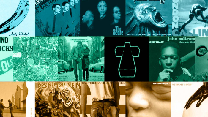
With the rise of streaming the humble album cover is becoming something of a lost art, which is a crying shame as this list of the best album covers of all time proves that there is some amazing art for the long player.
The rise of digital music, unfortunately though, threatens one of the greatest canvasses of art seen in the 20th Century - the record sleeve. Originally just a protective cover for the fragile crackly goods beneath, it soon evolved into a space for artistic expression in its own right, very often becoming as important as the music itself.
Sometimes, even more so: legend has it that the cover of New Order's Blue Monday was so expensive to make that their label lost money on every copy sold. Even the best album covers of all time, then, come at a price.
We've picked 50 of the coolest album designs ever created. Get these up on your wall as well as on your turntable. We want to know which you think is the ultimate album cover, so upvote your favourite designs.
Think we've missed out a stone cold classic? Let us know at the bottom of this epic album cover round-up.
Best album covers of all time

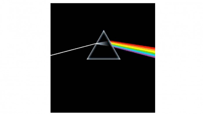
Artist: Pink Floyd
Album:Dark Side of the Moon
Designer: Storm Thorgerson
Roger Waters, Pink Floyd's bassist and singer suggested to designer Storm that perhaps for the cover of Dark Side of the Moon, he might not use a photograph. He replied, “What do you mean? That’s what I do. Pictures...I don’t do graphics.” Thankfully, for the history of album cover design, he embraced the challenge laid down to him. Using twin inspirations of Floyd's live light show and a triangle - a symbol of thought and ambition - he created this cover and a piece of musical and art history.

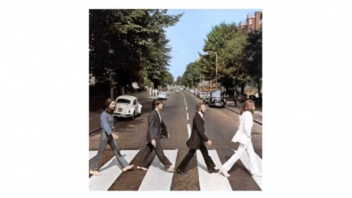
Artist: The Beatles
Album:Abbey Road
Designer: Kosh/Iain MacMillan
Quite simply, an utterly iconic image, with the Fab Four themselves at their coolest: John resplendent in a white suit, Paul barefoot. Perfectly in harmony, and utterly British. The crossing itself was given Grade II listed status in 2010 - there aren't many traffic artefacts that can boast that.

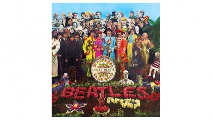
Artist: The Beatles
Album:Sgt. Pepper's Lonely Hearts Club Band
Designer: Sir Peter Blake
An obvious choice, but perhaps we are so used to it - so heavily has it been referenced and parodied - that we have forgotten just how brilliant a cover it is. Karl Marx, Marlon Brando and Marilyn Monroe made the final cut, Hitler, Ghandhi and Jesus didn't (Hitler deemed too controversial, Jesus was too soon after Lennon's claim that the band were bigger than the Son of God and Ghandhi was removed to ensure release in In

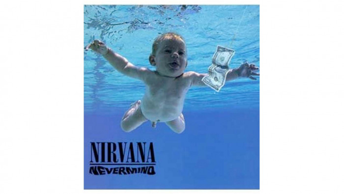
Artist: Nirvana
Album:Nevermind
Designer: Robert Fisher
The iconic image of an innocent baby swimming towards a dollar bill on a fishhook is one of the most instantly recognisable in musical history, worthy of the enormously influential breakthrough album that was Nevermind. Kurt Cobain reportedly conceived the idea after watching a TV program on water births, and a photographer was duly despatched, with the dollar bill being added afterwards. The meaning behind the image has never been revealed, and never will be, adding to the intrigue, and coolness of the sleeve.

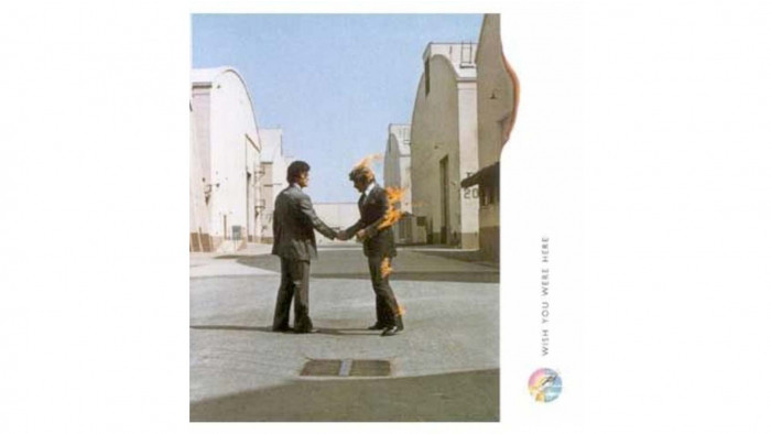
Artist: Pink Floyd
Album:Wish You Were Here
Designer: Storm Thorgerson
How do you follow Dark Side of the Moon's iconic artwork? Set a man on fire, that's how. For the overall concept, Thorgerson had centred on the idea of absence, with the album shrink-wrapped in a dark colour to hide the artwork - a somewhat peverse idea when that artwork was so cool - with the gesture of a handshake between the two men being inspired by Welcome to the Machine and Have a Cigar and by the idea that people hide their true feelings (the shrinkwrap) for fear of 'getting burned' (the cover) underneath. EMI were initially unhappy with the 'non-cover' but, says Storm, "after we stuck a cow on the front of Atom Heart Mother [an earlier album] they knew that anything to do with Pink Floyd was difficult."

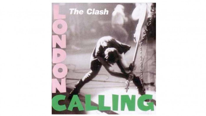
Artist: The Clash
Album:London Calling
Designer: Pennie Smith/Ray Lowry
It remains a fact of rock 'n' roll that there is nothing cooler than a) smashing your guitar, b) being able to afford to smash your guitar or best of all c) not being able to afford to smash your guitar but doing it anyway. The Clash went one better by d) smashing a bass. That thing weighs a lot. Pennie Smith's shot captured that essential sense of abandonment and loss of control, and Lowry's design, paying homage to the King of Rock 'n' Roll, Elvis's self-titled album, hammered home the point further. Often imitated, never bettered.

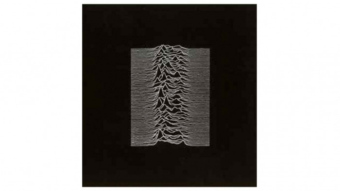
Artist: Joy Division
Album:Unknown Pleasures
Designer: Joy Division, Peter Saville & Chris Mathan
Everything about this cover is cool, from the decision for a new band to not have the album title or band name on the cover, to the use of such an abstract image as the centrepiece of the design. That image is not a mountain range, or a series of waves, but a set of successive pulses from the first pulsar discovered, PSR B1919+21. Joy Division drummer Stephen Morris apparently suggested it after seeing it in the Cambridge Encyclopedia of Astronomy in 1977 and the image was lifted wholesale; thus the much-imitated image is effectively copyright-free.

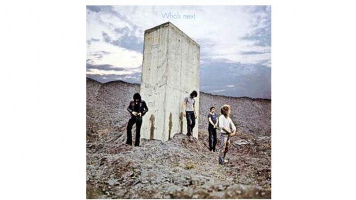
Artist: The Who
Album:Who's Next
Photographer: Ethan A. Russell
The Who have always made strange, but brilliant covers, and this was no exception, with the band photographed having apparently urinated on a massive stone monolith in Easington Colliery, an old coal mining town. The significance of the monolith, or the band's 'desecration' of it is unknown: perhaps it is a rejection of progress - the coal representing industrialisation; perhaps it is a reference to the monolith discovered on the moon in 2001: A Space Odyssey (director Stanley Kubrick had turned down the chance to direct the film version of the band's Tommy, so maybe this was payback); perhaps it was just a strange idea. Either way it's an extremely memorable, and cool, cover image.

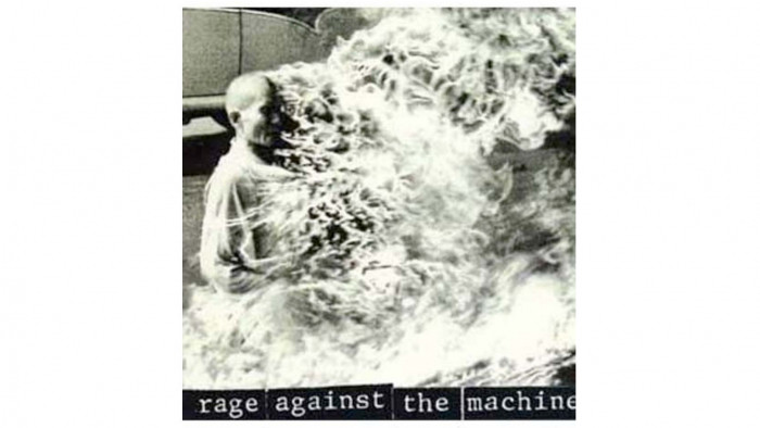
Artist: Rage Against The Machine
Album:Rage Against The Machine
Photographer: Malcolm Browne
Rage Against The Machine's 1992 self-titled debut album was nothing short of incendiary - a political and radical call-to-arms soundtracked by ferocious metal riffs. The cover was no less confrontational, featuring a photo taken by Associated Press correspondent Malcolm Browne of a Vietnamese Buddhist monk, Thích Quảng Đức, burning himself to death in Saigon in 1963, protesting against the Vietnamese administration's oppression of the Buddhist religion. A truly powerful image demonstrating one man's ultimate sacrifice for his beliefs, it was both shocking and inspiring, two ingredients for an iconic album cover.

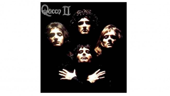
Artist: Queen
Album: Queen II
Photographer: Mick Rock
Queen enlisted Rock to capture the photograph for the cover of their second record, eager for some of the glam rock kudos that he had - following work for David Bowie, Lou Reed and Iggy Pop - to rub off on them, after their debut album had failed to take off as they had hoped. They initially thought the shot too pretentious, but Rock persuaded them to go with it - "It made them look like much bigger a deal then they were at the time, but it was a true reflection of their music" - and, of course, Rock was proven 100% correct, with the array of faces becoming truly iconic when used in the video for breakthrough opus Bohemian Rhapsody a year later.

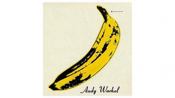
Artist: The Velvet Underground & Nico
Album:The Velvet Underground & Nico
Designer: Andy Warhol
It helped that the album itself would become a cult classic and hugely influential, but that Andy Warhol banana print could have been the cover of Jedward's debut album and still been considered an iconic sleeve image. Early copies of the album had the invitation to "Peel slowly and see" enabling the owner to peel back the banana skin to reveal a flesh-coloured banana underneath. Fruity indeed.

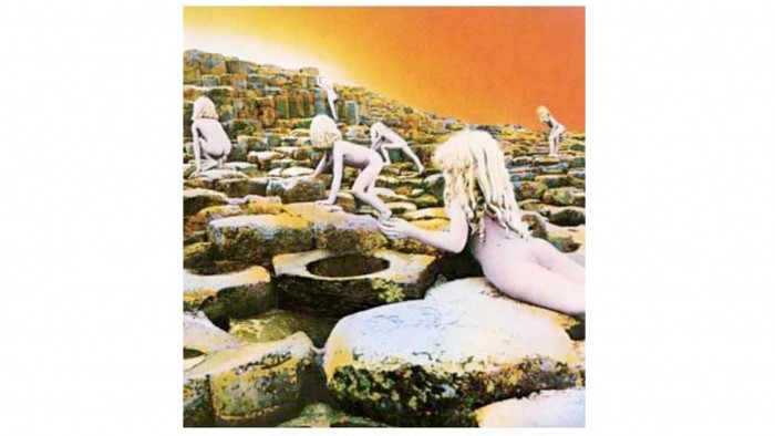
Artist: Led Zeppelin
Album:Houses of the Holy
Designer: Aubrey Powell/Storm Thorgerson
Thorgerson appears once more in this list, but few can deny the validity and coolness of this effort, for the mighty Led Zeppelin. Location? The natural wonder of the Giant's Causeway in Northern Ireland. What's on those basalt columns? A series of spooky looking golden-haired children (actually created using multiple-exposure shots of just two actors) crawling up towards a distant light. Alleged inspiration? The novel Childhood's End by Arthur C. Clarke, where children climb off the end of the world. Sinister, wrapped in mythology and very, very cool - yep, that's the Zep.


Artist: AC/DC
Album:Back in Black
Designer: Bob Defrin
AC/DC's first album following the death of lead singer Bon Scott had a cover that was appropriately sparse, dark and powerful. A simple outline of the band's iconic logo together with the title in plain typography, it perfectly complemented the music itself: simple, heavy, no-nonsense, and brutally effective.

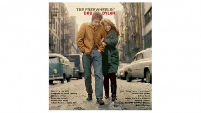
Artist: Bob Dylan
Album:The Freewheelin' Bob Dylan
Photographer: Don Hunstein
A cover where less is more, and is all the cooler for it. A casual photograph of Dylan with his then-muse Suze Rotolo, taken in the West Village, New York City, it was unusual at the time for being unstaged and unposed. Critic Janet Maslin described it perfectly as "a photograph that inspired countless young men to hunch their shoulders, look distant, and let the girl do the clinging".

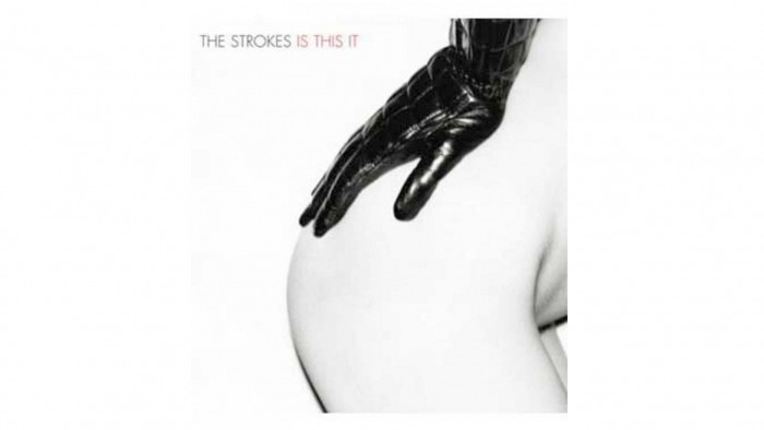
Artist: The Strokes
Album:Is This It
Designer: Colin Lane When The Strokes emerged, everything about them was cool. The music, the haircuts, the names and, of course, the album cover, which instantly became an all-time classic. The 'photoshoot' was apparently spontaneous, and featured photographer Colin Lane's then-girlfriend, who had just come out of the shower, and a glove that had been left in their apartment by a stylist. "There was no real inspiration, I was just trying to take a sexy picture" said Lane. He certainly did the job.

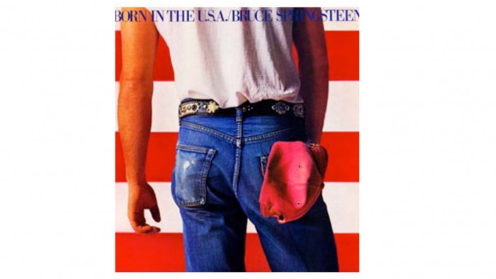
Artist: Bruce Springsteen
Album:Born in the USA
Photographer: Annie Leibovitz
The quintessential American image for the quintessential American artist, the cover for Born in the USA did exactly what it said on the tin. The American flag as the backdrop and the uniform of blue jeans, white shirt and red cap of the American blue-collar worker which The Boss celebrated in his lyrics. Shots were taken of Springsteen facing the camera but this one made the cut; Springsteen remarking, "The picture of my ass looked better than the picture of my face, so that's what went on the cover".

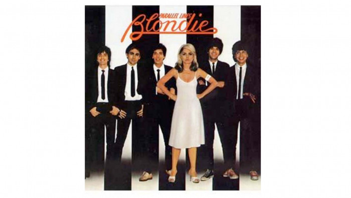
Artist: Blondie
Album:Parallel Lines
Designer: Ramey Communications/Edo Bertoglio/Peter Leeds
Take the coolest frontwoman of all time, stick the rest of the band in cool suits, and go monochrome, with the title in lipstick-red, and you have one very cool, and thoroughly iconic album cover. The band weren't so keen however: unimpressed that it gave the impression that Blondie was effectively Debbie Harry with a backing band, they ended up parting company with their manager Peter Leeds, who had suggested it.

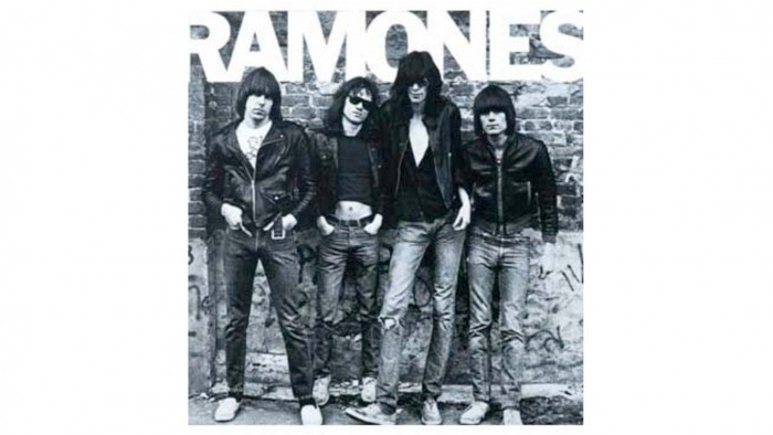
Artist: The Ramones
Album:Ramones
Photographer: Roberta Bayley Bayley remarked that getting The Ramones to pose for a photo was 'like pullig teeth', but the world would like to thank her for persisting, as the results formed one of the most enduring and cool rock 'n' roll images of all time. The monochrome image of the ultimate punk pioneers would be replicated by countless young hopefuls over the coming years, and immortalise Johnny, Tommy, Joey and Dee Dee forever.

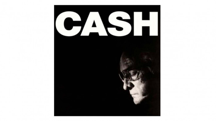
Artist: Johnny Cash
Album:American IV: The Man Comes Around
Photographer: Martyn Atkins
All five of the covers for Johnny Cash's last era of recordings, the American series are fantastic, with the big, simple typeface utilising the strength of the legend's name. However, the coolest is for IV: The Man Comes Around, as it juxtaposes that strength with the visible weakness of the Man In Black himself: nearing death and reflecting on his life he looks downward and prepares to fade to black himself.

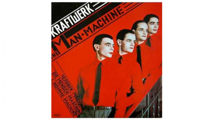
Artist: Kraftwerk
Album:The Man-Machine
Designer: Karl Klefisch/Günther Fröhling
The defining image of the German electronic pioneers - this perfectly captures the essence of Kraftwerk. Inspired by the 1930s Modernist movement, particularly El Lissitzky, the strict red and black colour scheme, arrangement of the band members in quasi-robotic fashion and translation of the title into various languages all adds up to a seriously cool album cover. Sehr guht, sehr cool.

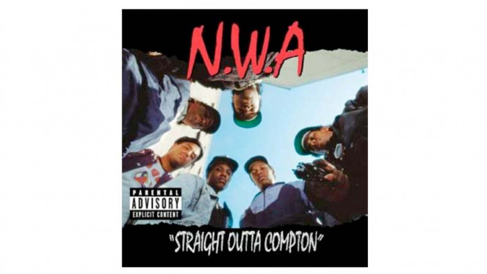
Artist: N.W.A.
Album:Straight Outta Compton
Designer: Helane Freeman
N.W.A. were a force of nature when they arrived on the music scene in the late 80s, being genuinely deserving of their self-declared status as 'The World's Most Dangerous Group'. The cover to their landmark album perfectly encapsulated what they were about, the group encircling the listener, as you stare down the barrel of a gun held by Eazy-E. The idyllic blue Californian sky provides the unlikely backdrop - all may have seemed sunny, but trouble was brewing in Compton.

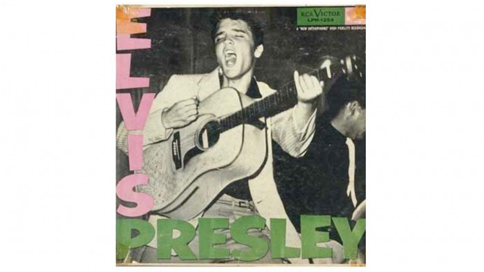
Artist: Elvis Presley
Album:Elvis Presley
Photographer: William V. 'Rd' Robertson
The album that changed everything, and a photograph that captured Elvis on the cusp of greatness. It doesn't come much cooler than that. The photograph was taken at the Fort Homer Hesterly Armory in Tampa, Florida, on July 31, 1955, with Elvis aged just 20. He was towards the bottom of the bill, but he wouldn't be there for long as this album, and the accompanying cover - arguably the world's first tangible image of a rock 'n' roll star - propelled him to immortality.

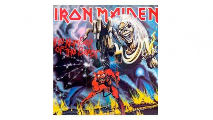
Artist: Iron Maiden
Title:Number of the Beast
Illustrator: Derek Riggs
No gallery of cool album covers would be complete without an appearance from Eddie, Iron Maiden's mascot and constant companion. Everything Riggs has ever done has been incredible, but we've opted for Number of the Beast. Originally the cover was designed for a single called Purgatory so Riggs opted for a heaven and hell design, which the band liked so much that they used it for the album. Amazingly, the call for the artwork came on a Friday and Riggs submitted it the following Monday in time for their deadline - he now claims "I wish I had more time to paint it, I could have done a better job", but it still looks pretty great to us.

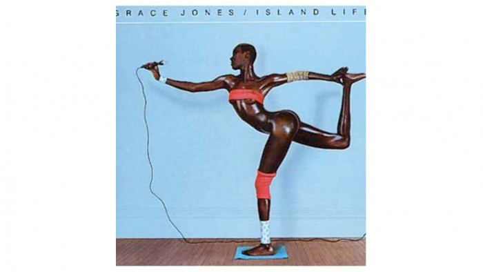
Artist: Grace Jones
Album:Island Life
Designer: Jean-Paul Goude
Grace Jones has created a series of truly incredible cover images in her career, but this one just about takes it for us. Created by her then-partner Jean-Paul Goude, the arabesque is, in fact, a montage of separate images. Such is the incredible power, beauty and, well, Grace of Jones' body that it's eminently believable that it is a real body position - but it is in fact anatomically impossible. Seriously cool.

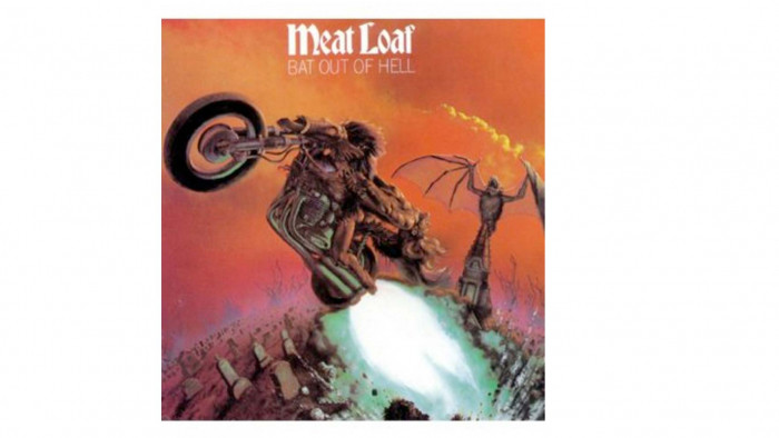
Artist: Meat Loaf
Album:Bat Out of Hell
Designer: Jim Steinman/Richard Corben
A crazy, yet brilliant cover befitting a crazy, yet album, the cover's concept was devised by Jim Steinman, the genius songwriter behind Bat Out of Hell. Naturally, it had a motorcycle erupting out of a graveyard with a giant bat looming over the tombstones in the background. Subtlety never was Meat's thing.

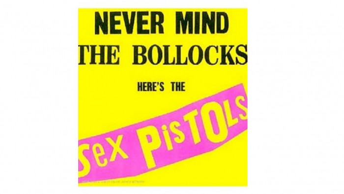
Artist: The Sex Pistols
Album:Never Mind The Bollocks
Designer: Jamie Reed
Reed had no interest in putting the band on the cover of the Sex Pistols' only record - "They were ugly anyway'' - so he used what he termed "cheap hype", using ransom-note style lettering, brash colours and simplicity that anyone could recreate; the perfect representation of the DIY punk aesthetic. Utterly unforgettable and utterly cool.

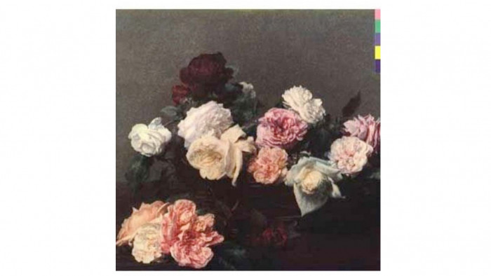
Artist: New Order
Album:Power, Corruption and Lies
Designer: Peter Saville This seminal work from Saville was part of a series of incredible cover designs. Power, Corruption and Lies was the 'keystone', with the decoder for the colour-based code found in the top-right corner, representing the title and band name, being found on the back cover of the album. The same code then appeared on the iconic floppy-disc cover for Blue Monday and also Confusion. The cover is a reproduction of the painting "A Basket of Roses" by French artist Henri Fantin-Latour with Saville explaining that they "suggested the means by which power, corruption and lies infiltrate our lives. They're seductive." A masterpiece of graphic design and undeniably cool.

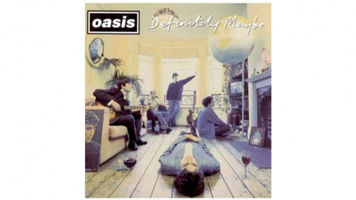
Artist: Oasis
Album:Definitely Maybe
Designer: Brian Cannon/Microdot
Brian Cannon, as head designer at Microdot, was responsible for a series of superb designs over the course of Oasis' first three albums, never dropping below sheer brilliance. For a band that used the musical primary colours of drums, bass, guitar and vocals and chords that any learner could play, their artwork was allowed to be more avant-garde, with the covers of Wonderwall and Live Forever, in particular being daringly stark but hugely effective. The cover for Definitely Maybe was an instant classic with various pieces of symbolism artfully placed in shot and the new five coolest guys on the planet poised to take over for the next decade.

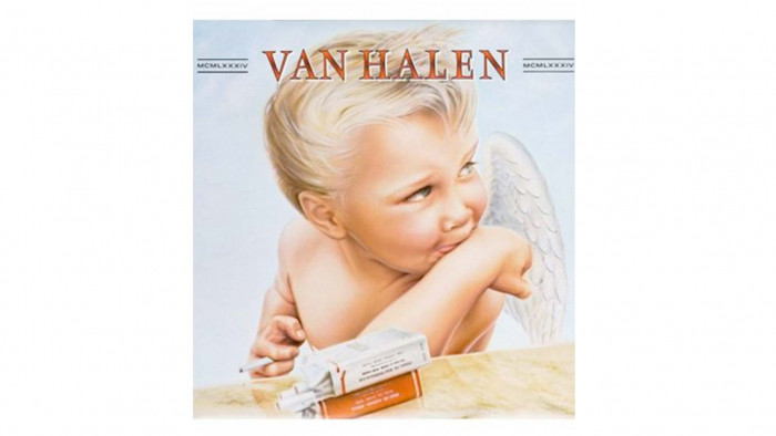
Artist: Van Halen
Album:1984
Designer: Pete Angelus, Richard Seireeni, David Jellison, Margo Zafer Nahas
A very naughty baby angel, with a mischievous look and cig in hand. Proof that Rock 'n' roll can corrupt anyone or anything. The Devil's got the best tunes, but this Angel's got Jump and Hot For Teacher underneath its cover.

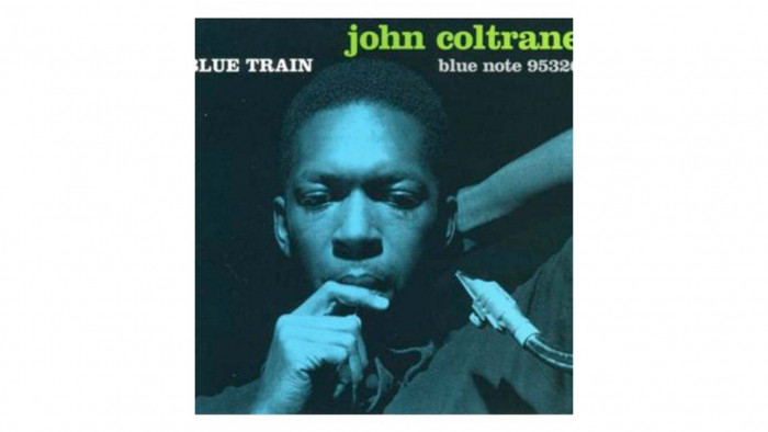
Artist: John Coltrane
Album:Blue Train
Designer: Reid Miles An iconic image of a true jazz great, the cover of Coltrane's Blue Train was supposedly inspired by Picasso's Blue Period. The photo, taken by Francis Wolff, certainly captures the sax legend in a pensive, thoughtful and, well, blue mood; basically looking like the super-cool legend he was.


Artist: Björk
Album:Homogenic
Designer: Alexander McQueen
Björk has always looked to push the envelope musically, and that adventurousness has also extended into her approach to album art. McQueen ran with the theme of Björk as a 'warrior of love', creating this incredible image. The hair alone weighed 10 kilos - sometimes one has to literally suffer for their art.

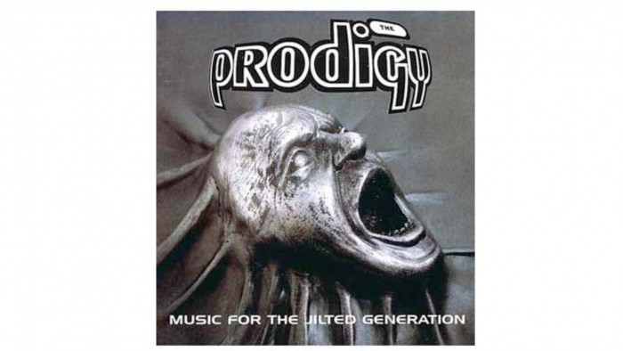
Artist: The Prodigy
Album:Music for the Jilted Generation
Designer: Stuart Haygarth
A record of ferocious power, attitude and force and, truly, a cover to match, a metallic howl of anger addressing the Jilted Generation which Prodigy so successfully reached. A brilliant and iconic cover.

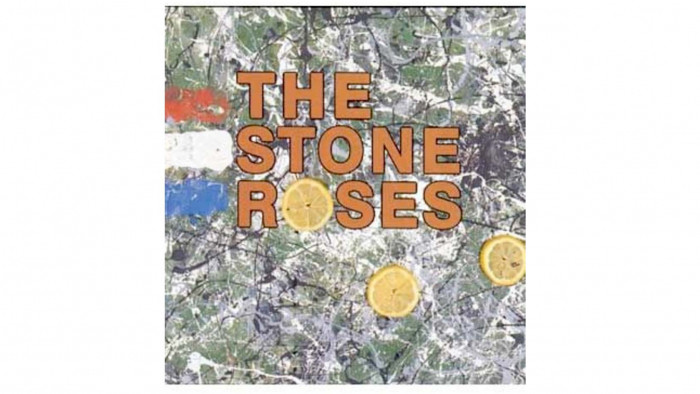
Artist: The Stone Roses
Album:The Stone Roses
Designer: John Squire
This iconic artwork was created by John Squire, a man hugely influenced by influential abstract expressionist painter Jackson Pollock (so much so that he was also referenced in the lyrics to earlier song Going Down). Entitled Bye, Bye Badman (also the name of a song on the album), the piece referred to the May 1968 Parisian Riots - hence the coloured daubings of the French tricolore on the left (the lemons were a nod to the fact that they could be used as an antidote to tear gas). An image which has adorned countless students' bedroom walls, and is still amazingly cool today.

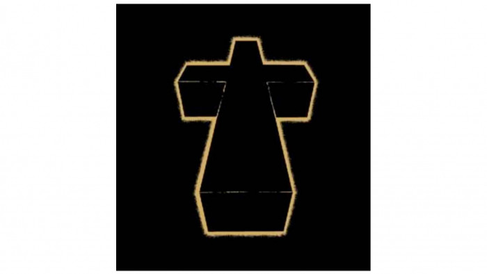
Artist: Justice
Album: Cross
Designer: Surface2Air
Justice were the coolest French duo since Daft Punk when they emerged in the mid-2000s, and their adoption of the cross as their symbol was appropriate, given the quasi-religious following they obtained as they built through the underground. The cover for their long-awaited debut † did not disappoint, with the colour scheme referencing T-Rex's Electric Warrior. C'est cool, c'est Justice.


Artist: Yeah Yeah Yeahs
Album:It's Blitz!
Designer: Unknown
Sometimes, the simplest things are the coolest, and this cover image for It's Blitz! is immediate, eye-catching and intriguing. You could say it's an egg-cellent cover. Yep, we went there.


Artist: Spiritualized
Album:Ladies and Gentlemen We Are Floating in Space
Designer: Mark Farrow Pet Shop Boys' collaborator Mark Farrow once again produced the goods on this uber-cool cover for Spiritualized's opus, designed to look like prescription medication. It had a recommended dosage = "one tablet, 70 minutes" - and was thoroughly appropriate given the epic, transcendental music contained within. Box set editions of the record took the concept further, with each track on its own three-inch CD inside a foil blister pack. Special instructions for use were included, with the question "What is Spiritualized used for?" being answered: "Spiritualized is used to treat the heart and soul.". So, so cool.


Artist: Sigur Rós
Album:Ágætis Byrjun
Designer: Gotti Bernhöft
The distinctive 'Alien Angel Foetus' design was created, remarkably, by Bernhöft using a Bic ballpoint pen but, using just this simple tool, he created the perfect visual representation of Sigur Rós' unique sound: otherworldly, eerily beautiful, and delicate.

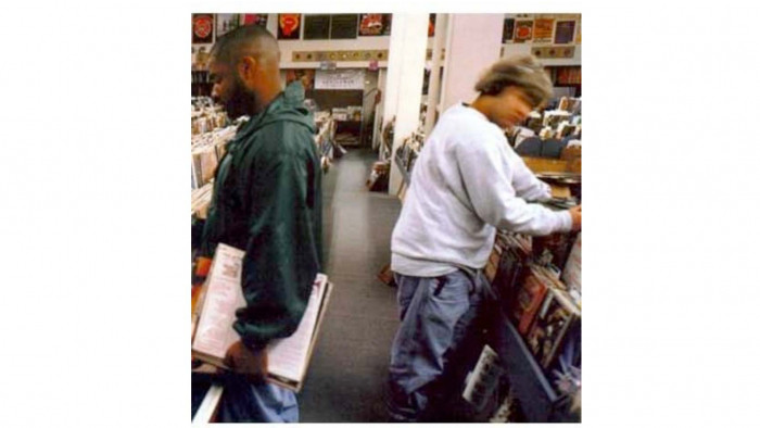
Artist: DJ Shadow
Album:Endtroducing
Designer: Unknown
Simple but elegant, this photograph of Solesides (a collective of which DJ Shadow was part) members Chief Xcel and Lyrics Born was taken at a record shop in Sacramento, California, doing what they do best: digging through records to find something exciting, or interesting, or rare, or new. A simple pleasure that sadly will probably be gone in a few years time when the last of the record shops close, but which Shadow understood entirely.

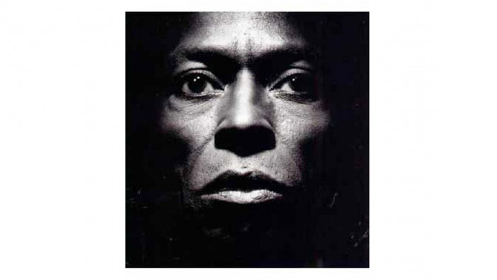
Artist: Miles Davis
Album:Tutu
Designer:
Eiko Ishioka/Irving Penn
Miles Davis was, of course, a true musical pioneer: a multi-faceted performer and songwriter, and capable of alternating between subtle beauty and extroverted flamboyance. But this superb cover image captures the man behind the music simply, and starkly. Unbelievably cool.


Artist: Lemon Jelly
Album:Lost Horizons
Designer: Fred Deakin/Airside
Lemon Jelly's second album was described in some quarters as an electronica answer to Pink Floyd and it wasn't just musically. The illustrated cover looked agrarian and peaceful at first glance, but on closer inspection revealed trees shaped like spikes, arranged in a pattern evocative of barbed wire.

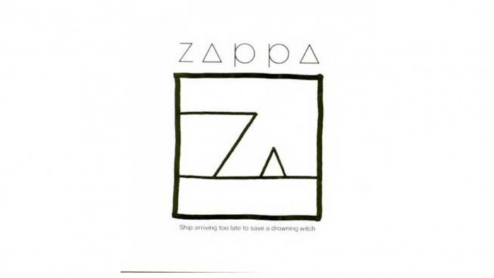
Artist: Frank Zappa
Album:Ship Arriving Too Late to Save a Drowning Witch
Designer: Roger Price
Only Frank Zappa would utilise a 'droodle' (a combination of doodle, drawing and riddle) - a form of humorous cartoon popular in the 1950s and 1960s - as both the artwork and title of an album, but then Zappa never really was one for following the rules; after all, this was a man who named two of his children Moon Unit and Diva Thin Muffin Pigeen. An alternative title for this droodle was 'Mother Pyramid Feeding Her Baby'. Amazing.

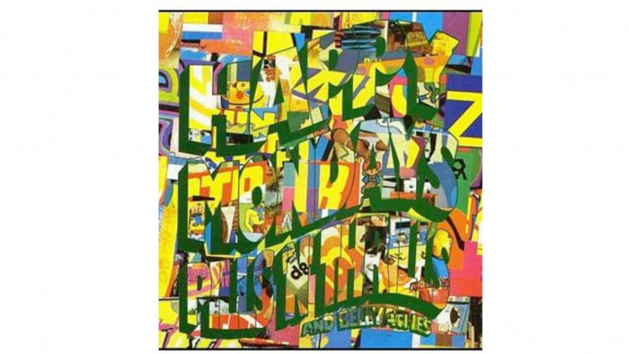
Artist: Happy Mondays
Album:Pills 'n' Thrills and Bellyaches
Designer: Central Station Design
A fantastic cover, following on from Central Station's brilliant work on Bummed and the Madchester Rave On EP, they hit top form with this. The cover was a perfect representation of the band's sound: an eclectic and colourful cut 'n' paste collage of various influences thrown together but somehow creating something brilliant, exciting and cool.

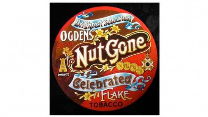
Artist: The Small Faces
Album:Ogden's Nut Gone Flake
Designer: Mick Swan
One of the very first album covers to think outside the box - literally - this record was originally released on vinyl in a giant tobacco tin, modelled on the Victorian-style containers such as Ogdens' Nut-Brown Flake, a brand of tobacco that had been produced in Liverpool since 1899. The tin opened to reveal the record along with a poster consisting of five interconnected paper circles, each one bearing the image of a band member. One Direction eat your heart out.

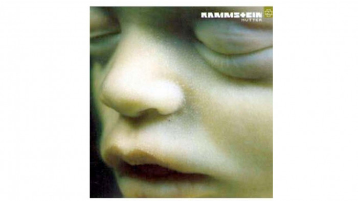
Artist: Rammstein
Album:Mutter
Designer: Dirk Rudolph/Daniel & Geo Fuchs
For people who weren't sure what to make of Rammstein, and who viewed them as something of a joke - with their pyrotechnic live shows and their insistence on singing in their native German - Mutter [Mother] was the album where people were forced to take them seriously. Epic, haunting music and production, and an equally haunting cover photograph of an unborn foetus taken by Daniel and Geo Fuchs.

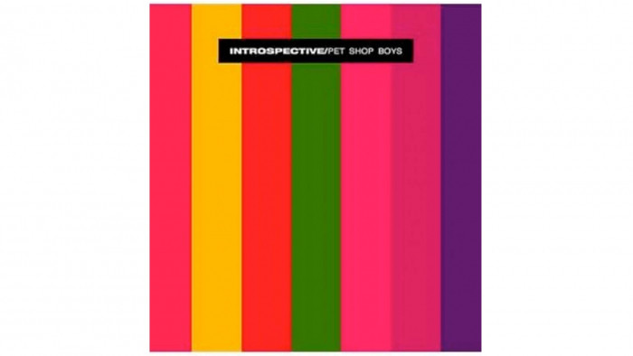
Artist: Pet Shop Boys
Album:Introspective
Designer: Mark Farrow/Pet Shop Boys
Mark Farrow has been the Pets' image man for most of their long career, with an incredible body of striking work to complement their carefully cultivated image and style. We've opted for the cover of Introspective as the coolest of them all. Whereas the art for Please and Actually was stark minimalism, on Introspective he - ironically, given the title - opted for a bold and attention-grabbing set of columns, which looked stunning in its original 12 inch form.

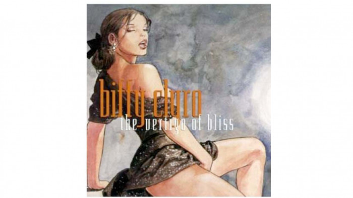
Artist: Biffy Clyro
Album:The Vertigo of Bliss
Designer: Milo Manara
A prolific comic book writer and artist, Manera was approached by the-then cult band Biffy Clyro to provide the artwork for their second album, The Vertigo of Bliss. As befitting a band who were wilfully obtuse - see the nonsensical name, and song titles including Toys, Toys, Toys, Choke, Toys, Toys, Toys - this erotic and controversial cover only endeared them more to the small, but loyal fanbase they were beginning to cultivate.

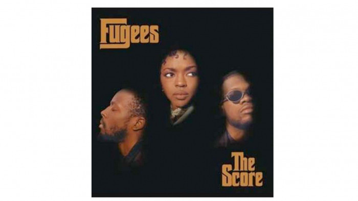
Artist: The Fugees
Album:The Score
Designer: Brain/Richard O. White/Marc Baptiste
One of the coolest hip-hop collectives of all time, at the peak of their powers, this seminal record also boasted an effortlessly cool cover, all three contributing members - Wyclef Jean, Pras Michel and Lauryn Hill - pictured individually, but together, for a sleeve with a cinematic feel; appropriate for an album that Hill described as 'an audio film'.

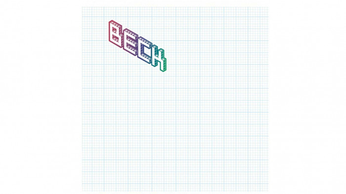
Artist: Beck
Album:The Information
Designer: Various/The Listener
How cool is this album sleeve? Well, it's as cool as you want it to be. Beck created a stir in 2006 when his album The Information was released with a cover consisting of a simple sheet of graph paper, and a set of stickers that the listener could arrange as they wished. It was declared to be 'anti-packaging' but paradoxically resulted in an infinite amount of different designs being available. Seriously cool.

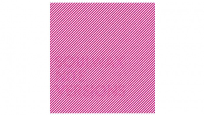
Artist: Soulwax
Album:Nite Versions
Designer: Trevor Jackson
Multi-talented artist and musician Trevor Jackson (of Playgroup, amongst others) produced this beautiful piece of Peter Saville-esque graphic design for this Soulwax remix album. Eye-catching, yet subtle, it is very cool indeed.

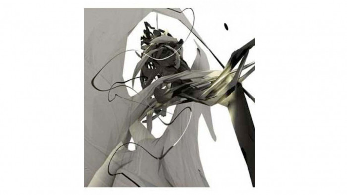
Artist: Autechre
Album:Draft 7.30
Designer: Alex Rutterford
Matching the music of the famously obtuse and forward-thinking electronic band, Rutterford created this piece, entitled "Theme of Sudden Roundabout''. This is suitably abstract and unpredictable, yet compelling and beautiful; a cool, modern classic.
- The best true wireless earphones - all tried and tested.
- Our pick of the best vinyl and best vinyl box sets - complete you collection now.
Latest
Related Reviews and Shortlists

The 10 best war movies of the 21st century

The Last of Us season 3 announced


