ShortList is supported by you, our amazing readers. When you click through the links on our site and make a purchase we may earn a commission. Learn more
16 February 2012
Ah the dark art of the movie poster. We've written a fair deal on how much we love a good one and also how much we loathe a dodgy one but what's the formula for what really works?
This rather smart infographic takes a look at what poster designs were most popular in the last year and then dissects the top 10 movies at the box office to see what has worked the most.
Conclusions? Well, it's all about Sans Serif and cooler colours. Oh and Daniel Radcliffe's face.
Thanks to the clever guys at Colourlovers.com for the image.
Latest
Related Reviews and Shortlists
Entertainment
![The 10 best war movies of the 21st century]()

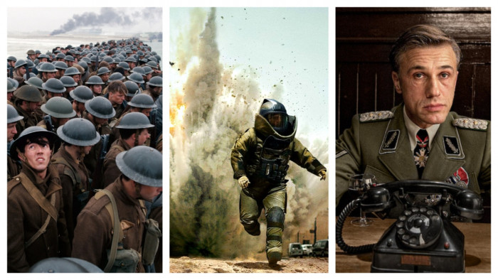
The 10 best war movies of the 21st century
Entertainment
![The best movies on Netflix: this is what to watch]()


