5 things we learnt from the designer behind Microsoft’s Surface Earbuds
We got hands on with the earbuds alongside designer Kait Shoeck


Get exclusive shortlists, celebrity interviews and the best deals on the products you care about, straight to your inbox.
You are now subscribed
Your newsletter sign-up was successful
Alongside the launch of Microsoft’s latest Surface Pro 7, Surface Pro X and Laptop 3 devices at the brand’s recent Surface event, another - albeit smaller - product is ready to challenge the way you use earbuds.
Microsoft’s Surface Earbuds have been three years in the making. Three years of analysis, materials testing and designing - and then a fair bit of redesigning.
“We started developing them way before wireless earbuds became a standard thing,” notes Microsoft’s senior industrial designer, Kait Shoeck.
“We started with thousands of scans of ears and it really came down to trial and error. So it was a crazy process - there must have been at least 500 [design variations].”
News of the launch has been somewhat overshadowed by the long-awaited arrival of Google’s 2nd gen Pixel Buds - which are set to hit shelves in close proximity to Microsoft’s offering. Not to mention Apple’s wireless AirPods and Samsung's Galaxy Buds also competing for a slice of the pie.
However, what’s become clear is that Microsoft’s leap into the world of wireless earbuds aims to cater to more than just the Spotify-listening, bass-pounding music fan. The touch-sensitive design aims to help you work on the move.
“Surface Earbuds are designed for someone who always wants to be connected on the go,” notes Shoeck. “Someone wants to accomplish and get stuff done - and that was part of the challenge, how do you do that without a screen?”
Get exclusive shortlists, celebrity interviews and the best deals on the products you care about, straight to your inbox.
Featuring Cortana, Office 365 and Spotify integration, each bud also features two microphones for optimised call quality. They also offer live translation and real-time dictation - which, aside from being a bit of a novel concept, could be a real game-changer.

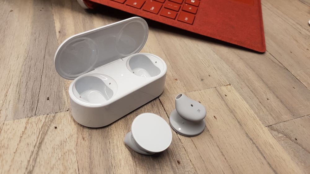
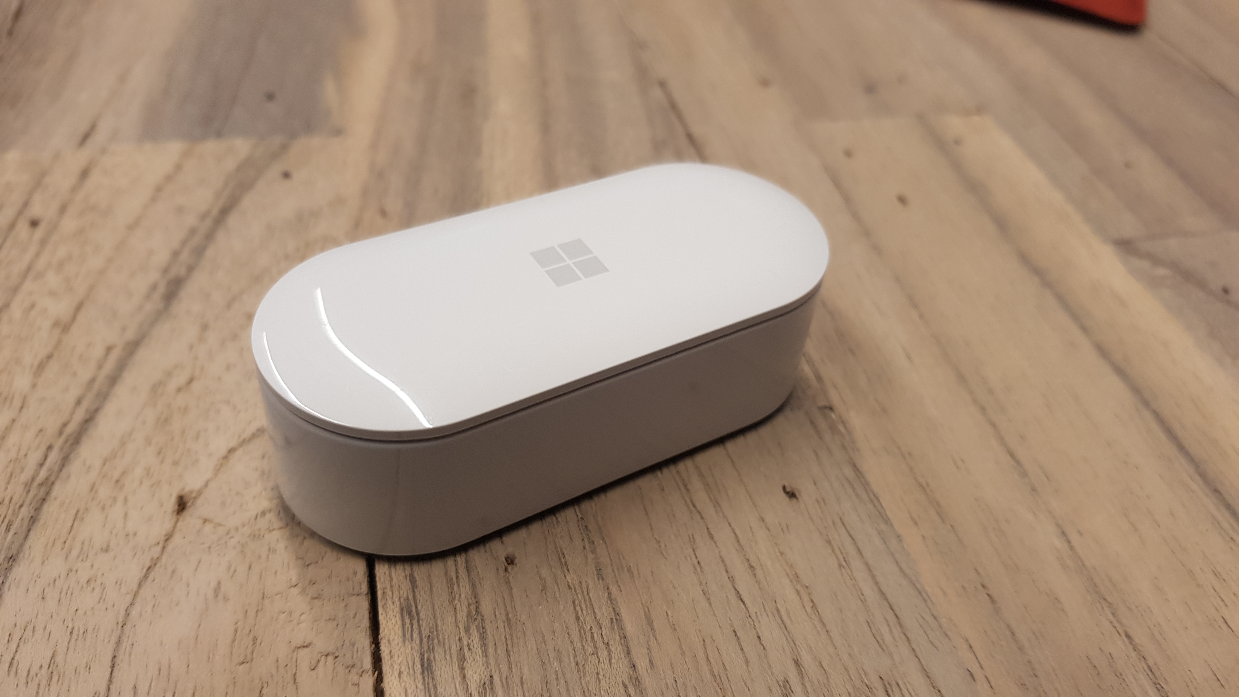
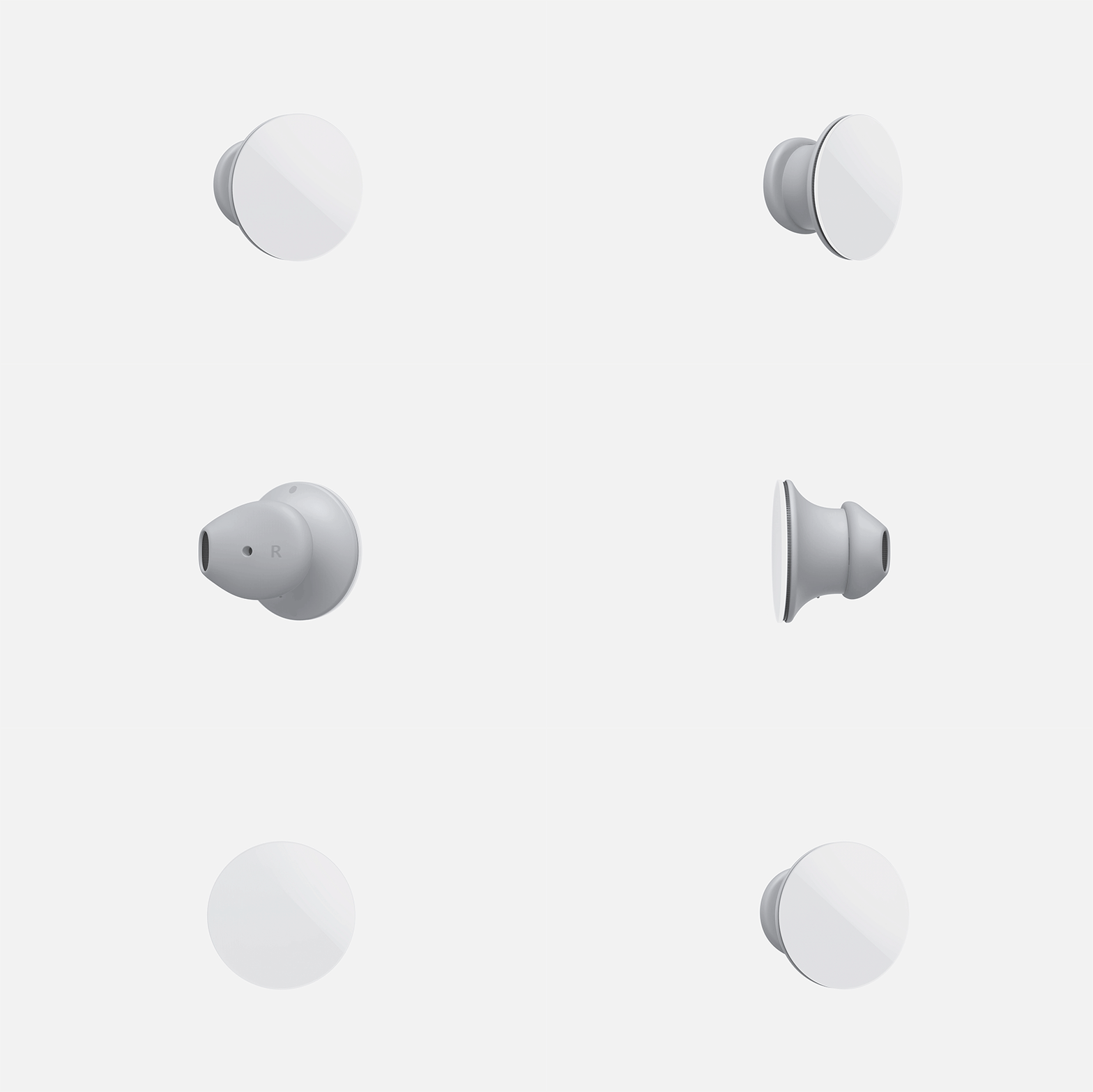
When it comes to appearance, Microsoft’s minimalist circular offering - with its touch sensitive face - features a pretty simple, sleek but bulky finish. You can take calls, control tracks and adjust volume all from the movement of a finger.
Granted, the price point of $249 (around £200) is noticeably steeper than its Pixel Bud competitor at $179 (around £140) - something that is bound to put some people off. But it’s that more-than-just-for-music element that’s set to entice the multi-taskers of the world.
The fit is definitely a snug one - with three silicone sizing options to choose from. The buds also employ a ‘twist-to-secure’ fit, ensuring they don’t fall out on the move. What we can say is that we tried to headbang like a die-hard metal fans we were always destined to be and, on a positive note, they didn’t budge an inch.
It’s also worth noting that despite these earbuds creating a secure seal, they are not designed to be noise cancelling.
As for the claims of 8 hours worth of battery life? These buds will require more long-term hands-on time to find out, but what is clear is that charging the Surface Earbuds for 10 minutes gives you extra hours worth of play time.
We caught up with Microsoft’s senior industrial designer, Kait Schoeck, to discover some of the secrets behind the Surface Earbuds.
- Looking for your next pair of wireless headphones? Discover our pick of the best true wireless earphones around.

Microsoft didn’t know much about wireless audio when they started
“When we first approached it we were like ‘oh let’s design some wireless earbuds, cool, let’s try it!’ but you don’t even know what goes into it,” notes Shoeck. “So I didn’t know initially, that to control sound properly, sealing your ear is really important because you can control the environment.”
“One issue with a product like that is how it sits with hundreds of different orientations and works for everyone, and the challenge with that is different microphones and how we make sure the microphones are positioned correctly for everyone.”
There were some seriously strange prototypes
“One prototype was even around the neck. We tried to separate the internal elements from the ergonomics and have those internal elements live on a sort of like beads on a necklace. We even tried one design with a fit system that sort of enlarged when you twisted it - a bit like a flower opening.”
“Then we said, if we’re not going to do a cable thing, what would this look like if we went and put the components on the outside. It looked like a pill shape and then it had the components attached. What we liked was that when it was in your ear, it could sit in hundreds of different orientations.”
Some designs were just too intimidating
“When we saw the landscape of what fitted well, some of the models looked really intimidating, with 50 different fittings and hooks,” says Shoeck. "So we said that we wanted this to fit as many people as we can with three different fittings. We want it to feel approachable and friendly.”
Microsoft designers Like To ‘boil the ocean’
“We sometimes call the development process ‘boiling the ocean’ because sometimes we have to boil the ocean to try all of these ideas. So by the time it gets released, you feel super confident. Boiling the ocean means when you look back, you can genuinely say I don’t think I could have done anything more.”
They struggled to make silicone parts in the US
“One of the biggest challenges we ran into was actually the silicone,” notes Shoeck, “because it’s actually really hard to make silicone in the US. That’s another thing I didn’t know. Getting the right coating on it so it wasn’t really sticky was one thing, but getting it done in time was another. So we started bringing everything in-house. We did it ourselves, we brought the machines in-house, we wanted it faster.”
Most newsletters are rubbish. Ours isn't.
Get exclusive shortlists, celebrity interviews and the best deals on the products you care about, straight to your inbox.
As a former Shortlist Staff Writer, Danielle spends most of her time compiling lists of the best ways to avoid using the Central Line at rush hour.
