Given the fast-paced nature of modern football, with its never-ending new gimmicks (heated manager car seats and the rest), we're pretty surprised that it's taken them this long.
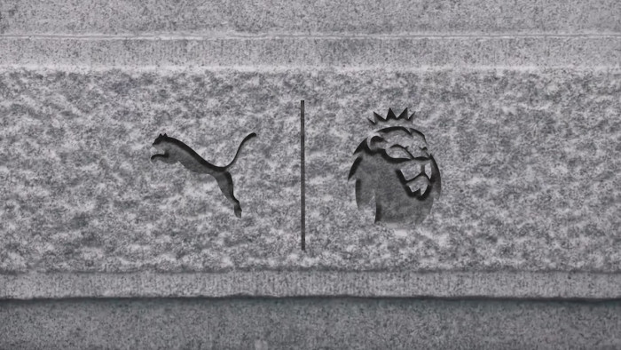
But the Premier League is today launching its first change of logo and identity in ten years. The classic lion icon has been reworked, with the typography also updated to a more modern feel. It also looks like vibrant colours are very much on the menu, rather than the familiar palette of black, blue, red and white of yesteryear.
In addition, there will be no headline sponsor - almost certainly due to the riches that the new TV deal, which starts next season, is bringing in.
Premier League Managing Director, Richard Masters, said: “From next season we will move away from title sponsorship and the competition will be known simply as the Premier League, a decision which provided the opportunity to consider how we wanted to present ourselves as an organisation and competition.
“We are very pleased with the outcome: a visual identity which is relevant, modern and flexible that will help us celebrate everyone that makes the Premier League. We look forward to sharing more details of our new positioning in the coming months.”
The Premier League are also promising to embrace the grassroots by having a presence in 10,000 primary schools from next season, with an aim to be in every primary school by the 2021/22 season. With a number of protests in recent times, they are also going to push the away supporters' scheme to attempt to reduce ticket prices - ultimately controlled by the clubs - and help with travel.
Take a look at the branding below - as well as a trip down memory lane with the previous versions of the logo since the league's incorporation back in 1992.
Latest
Related Reviews and Shortlists


