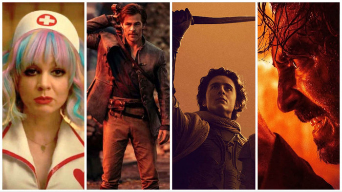
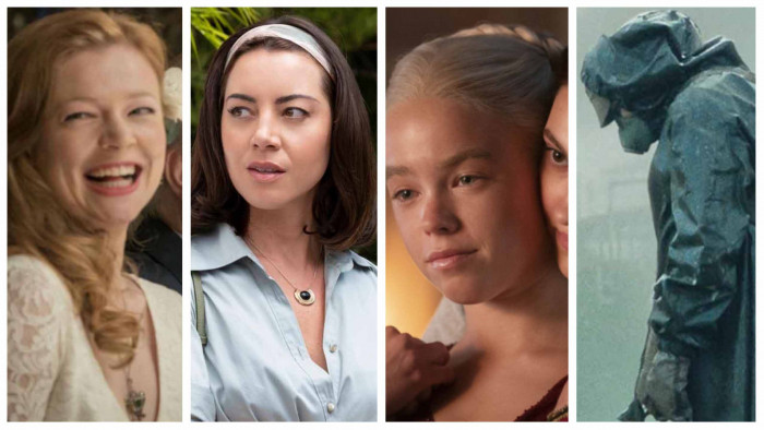
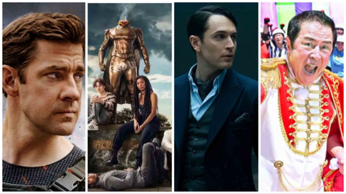
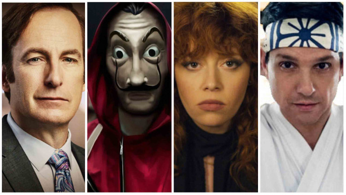
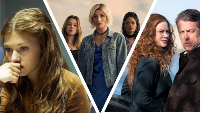
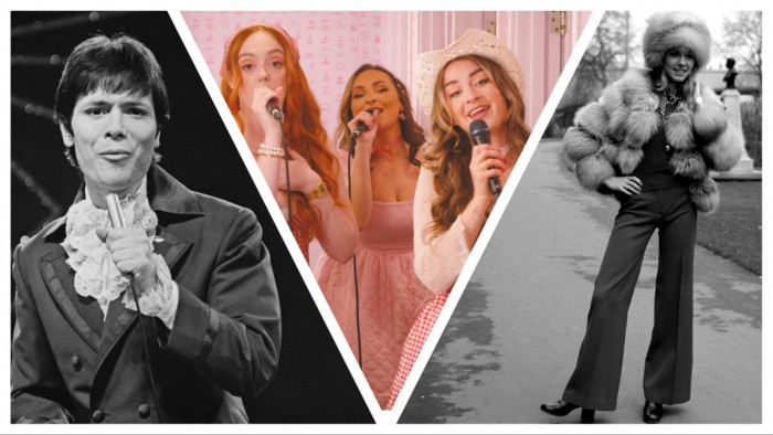
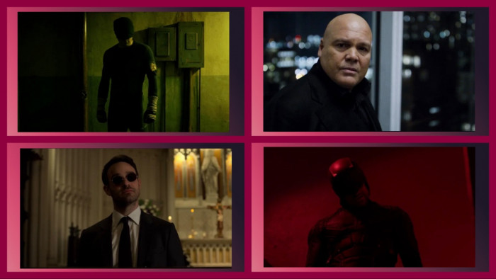
They're in your laptop. They're watching your every click, every binge session, every guilt-ridden "Play next episode".
Yep, Netflix knows everything about your streaming habits - even down to the images you're most likely to click on when scrolling through their menus.
Global Manager of Creative Services Nick Nelson has taken to Netflix's blog to explain how the streaming giant fine tunes its thumbnail images to convince you to watch a show.
Turns out it's a lot more complicated than "make it look sexy". Here's what goes into Netflix's image choices.

Emotions are everything
Humans are hardwired to respond to faces - it's how we read people. But as Nelson notes, faces with complex emotions outperform stoic or benign expressions: "seeing a range of emotions actually compels people to watch a story more."
Apparently, this is "likely due to the fact that complex emotions convey a wealth of information to members regarding the tone or feel of the content, but it is interesting to see how much members actually respond this way in testing.
"An example of this is seen in the recent winning image ('winning' means it drove the most engagement) for the second season of Unbreakable Kimmy Schmidt (indicated by the green arrow)."

Every region differs
"While we are becoming more connected across cultures, we have seen that regional differences still exist and are important for some titles and imagery," explains Nelson.
"A good example of this is Sense8, a Netflix series in which eight people can telepathically experience each other’s lives.
"When it came to the artwork for this title, this diversity was reflected in the winning images and how much they varied between different countries and cultures.
"Examining regional differences helped us see that while great stories transcend borders, it is important to understand how presenting each story in different regions impacts how quickly members from around the world actually discover that story through artwork."

Bad guys are good
"Throughout our research, we have seen that using visible, recognisable characters (and especially polarising ones) results in more engagement. Our members respond to villainous characters surprisingly well in both kids and action genres in particular.
"For Dragons: Race to the Edge, the two images of villainous characters seen below significantly outperformed all others..."

Less is more
"One of the earliest trends we saw was an image’s tendency to win dramatically dropped when it contained more than 3 people," writes Nelson.
"This directly informed our creative decisions for Orange in the New Black. This can feel counter-intuitive, particularly with shows that have an eclectic mix of talented lead characters.
"But while ensemble casts are fantastic for a huge billboard on the side of a highway, they are too complex at small sizes and ultimately, not as effective at helping our members decide if the title is right for them on smaller screens."
So there you have it. That's how Netflix gets into your head with something as simple as a thumbnail.
[Via: Netflix]


