You love a map, I love a map, we all love a map. You want a map? Here’s a map of Alton Towers.

Great isn’t it?
But probably the most-loved map is that of the London Underground. It’s a piece of classic design, and also one that most Londoners are intimately familiar with, having checked it over a thousand times or more.
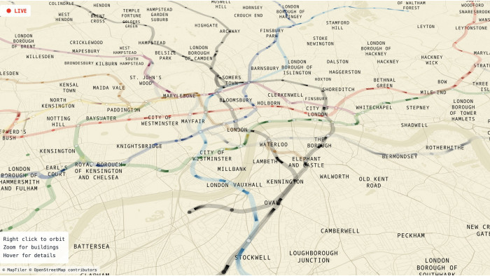
But, of course, as any true map-lover knows, much like the Alton Towers map, it is not a geographically accurate map, and many a smartarse will bore you on how the lines don’t exactly follow that route and how central London has been enlarged. But now you can simply show them this excellent animation, which rocks back and forth between the real shape of the tube lines and the ones on Henry Beck’s famous map and retort: “Yeah, I know.”
Kind of beautiful, isn’t it? It looks like a beating heart.
And that’s not the only one – further animations have been doing the rounds on Reddit in recent weeks, and we’ve picked our faves below.
Enjoy, you map-loving fiends, you.


