Vaughan Oliver remembered: his favourite 4AD album sleeves revealed
4AD designer Vaughan Oliver in his own words.


UPDATE: Celebrated graphic designer Vaughan Oliver has died at the age of 62. The designer leaves a legacy of work behind that completely changed and challenged the art of the record sleeve.
Here is a 2013 article about the artist and his work, republished in memory of Oliver and the brilliant work he will be remembered for.
ORIGINAL ARTICLE
We're about to get very middle class on you. Not only are we talking about a coffee table book - clutter for pretentious people - it's a coffee table book about 4AD, the record label described by Pixies' Charles Thompson as "artsy-fartsy". But gosh is it a pretty book.
Facing The Other Way: The Story of 4AD is a detailed history of the iconic independent record label 4AD, signer of painfully cool bands including Cocteau Twins, Pixies, Throwing Muses and The Breeders. The book's author, Martin Aston, draws on eye-opening interviews with artists and label staff, exploring 4AD's first 20 years in which founder Ivo Watts-Russell guided it to become one of Britain's most influential independent labels.
The book also includes extensive artwork from the label's catalogue of releases. In the following gallery, 4AD designer Vaughan Oliver has collected together his 11 favourite album sleeves from the label's history, providing insight into their inspiration.
- The best record players revealed
- The best vinyl records to impress your mates
- The best vinyl boxsets to add to your collection
Facing the Other Way: The Story of 4AD is published by The Friday Project and available now
(Images:All designs by Vaughan Oliver; Photography of Various 4AD Artists: Lonely Is An Eyesore by Colin Gray; Photography of Pixies: Minotaur by Unknown)

Breeders: Pod
A male fertility dance in response to some very visceral music from an almost all girl band. Kim Deal has a sense of humour to which I was trying to appeal. I also loved her and in an attempt to woo her I strapped on a belt of eels and danced for Westenberg's camera. No photoshop, just a long exposure. It needed to be long to accommodate the appendages.

Red House Painters: Down Colorful Hill
We always try to reflect the "atmosphere" of the music. This is one of our more successful attempts. Something in the lyrics about a big bed in a small room brought to mind a photo of Simon Larbalestier's. A ready made. I like the pubic triangle above the pillows.
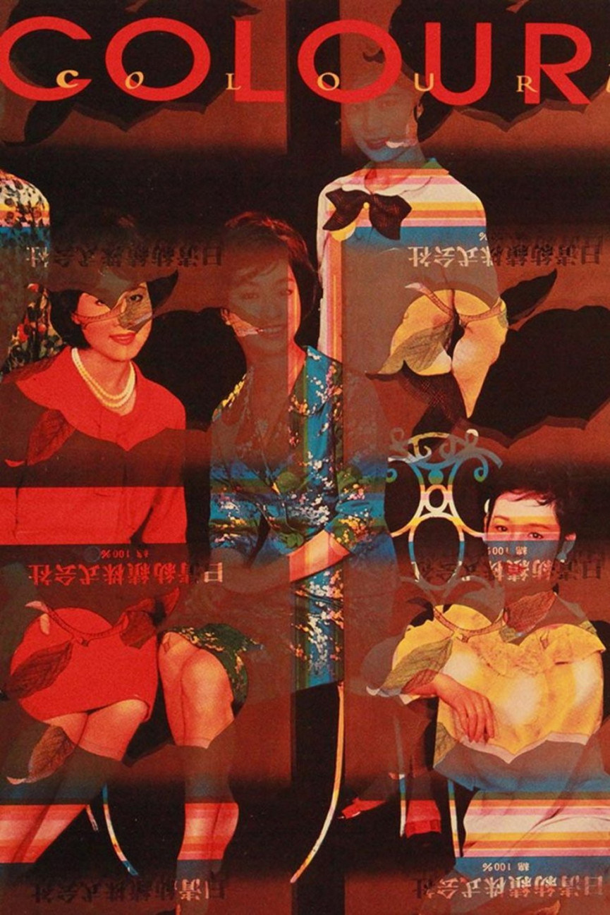
Colourbox: Colourbox
Another ready made. Sheet found on a printer's scrap pile in Japan by a friend cum tutor cum landlord and gifted me when I arrived in London in 1980. Seemed to fit perfectly Colourbox's groundbreaking magpie/sampling approach.

Clan of Xymox: Clan of Xymox
I was excited by the idea of taking the track listing and working it as an image. Information as illustration. I hadn't seen this idea realised in this way previously. Our aim was always to try and break new graphic ground. To experiment and pervert convention. Terry Dowling, my old tutor at Newcastle, provided the puppet print representing the band members. Terry remains one of my biggest influences. He opened my mind to new ways of thinking.
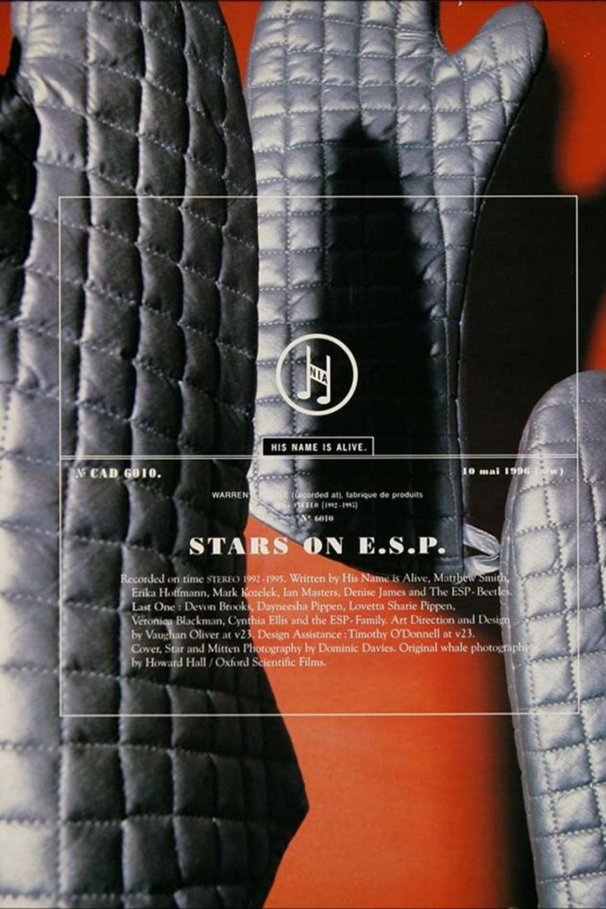
HNIA, His Name is Alive: Stars on ESP
Warren Defever (HNIA) talked about the mitten shape of his home state Michigan. When natives of this state meet they hold up their hands and point to which part they come from. How! Like Indians. I love oven gloves and photographer Dominic Davies made this super picture. On the back sleeve we are making a STAR on a kitchen table inspired by the idea that we are all stardust.

UVS: Ultra Vivid Scene
Kurt Ralske (UVS) would give me pages torn from old magazines. This is an advert for toothbrushes but in it's new context the syringe takes on more sinister connotations. That's when re-appropriation is valid. The multiple spines on the back were inspired by a walk through the 4AD warehouse next to our studio space. The silver gaffer tape idea came from a package that was sat next to my desk at the time but also connected with the view of a stage set where all the wires are taped down.

Various 4AD Artists: Lonely is an Eyesore
Limited edition (100) Box set 1987. Contained vinyl, video, cassette, cd, etching and screenprint. Marked a watershed moment in 4AD's evolution. I knew I was in the right place with the right man, Ivo Watts-Russell, when he went for this deluxe concept housed in American beech and gave half of them away to the musicians involved. This was a compilation of everybody on the roster. Sold the rest at a give away £100.00 each. The V&A Museum bought one for their archives. The image on the front of the sleeve is a picture of the baseboard of our artwork camera. A picture of nothing basically. I like that.
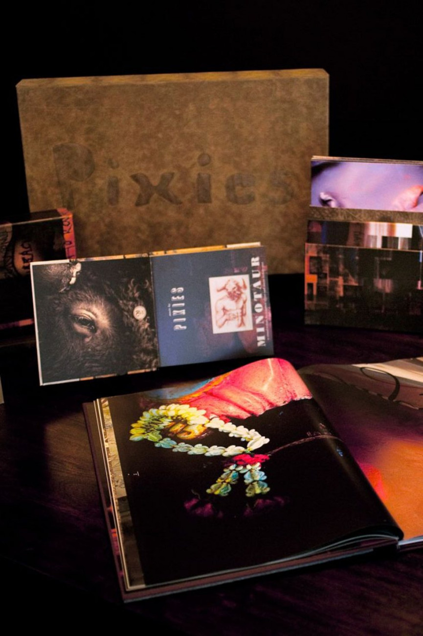
Pixies: Minotaur
Another box set. We threw out all the old Pixies artwork and started again. Working with photographer Larbalestier and a group of students at UCA, Epsom, I designed a large format book and packaging to hold all Pixies album back catalogue. I saw this package as a response to the diminishing presence of the music package. An antidote if you like.

The Breeders: Mountain Battles
Searching for beauty in violence we were trying to echo the spirit of the Fauvist painters and the fractured nature of some of their work. I suggested to photographer Marc Atkins that we use glass. Very easy for me to say. I still can't understand how Marc brought such life to the inanimate sheets of glass on his studio floor. The man is genius.

Pixies: Doolittle
"5,6,7 Monkeys Gone to Heaven" was the refrain on the supporting single. Larbalestier shot the monkey. Who shot the Sheriff? I liked the challenge of using exactly the same photo from that sleeve and processing it to reflect the screenprint medium. Meanwhile, Black Francis broke my heart by telling me that successful pop music was simply the intellectual pursuit of good mathematics. Simple me thought it all came from the heart. Then I remembered that Golden Section theory used in the composition of Renaissance painting so I made my own grid to place over the monkey.

Pixies: Indie Cindy
Not 4AD but my most recent piece of work featuring front sleeve illustration by Ian Pollock. It's mischievous and provocative and very beautiful. I've followed Pollock's work for 33 and a third years but never had the opportunity to commission. It's a fresh move for the Pixies artwork and one which I'd love to continue. The inner sleeve in fluorescent orange and gold foil is quite a surprise.


