If you are sat there reading this thinking that Zepp are plucky upstarts in a rather crowded smartwatch market, then you are right... kind of.
The brand is new but the company behind it is not. Zepp was once Amazfit, known for its very affordable smart things that you would slap on your wrist. But with this rebrand its got itself a haircut, a new suit and is pushing into the more desirable end of the smartwatch market.
Given this is a place where the spectre of the Apple Watch looms large and the likes of Samsung and Huawei are also smartening up their smart wares, can the new-ish Zepp shine?
Here are 5 things to know
1. The Zepp E has a stylish, familiar-looking design
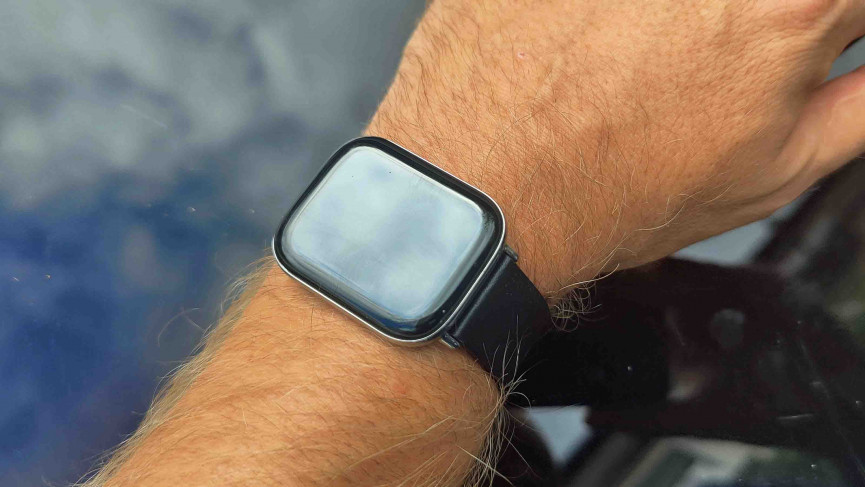
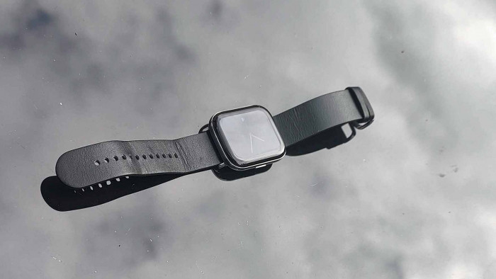
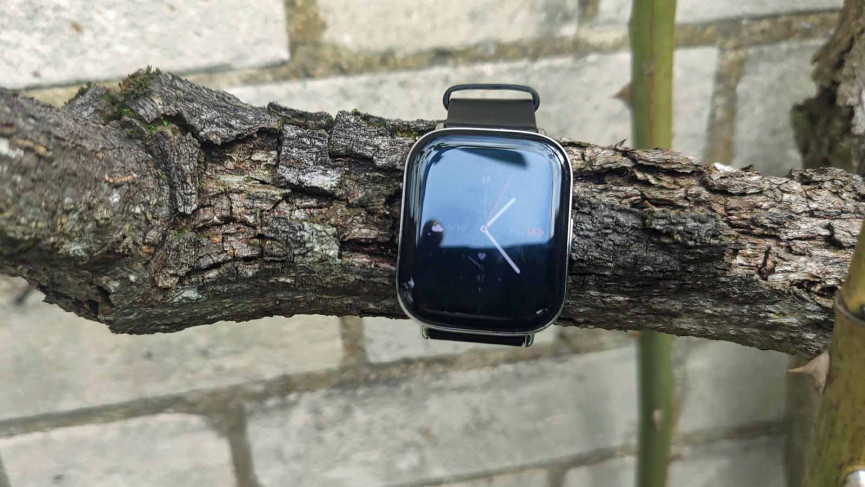
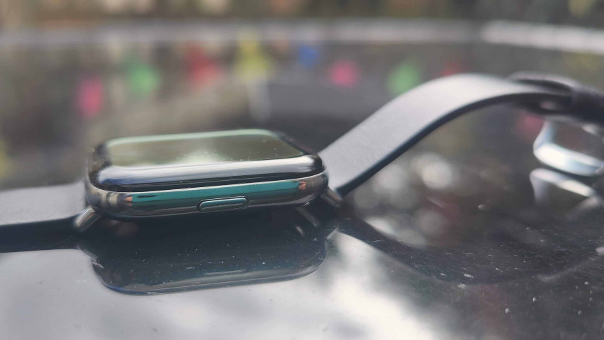
The Zepp E smartwatch range comes with a choice of faces: there is the Zepp E Circle and the Zepp E Square. The one we have been using for some time now is the square variant and it's a really sleek, if familiar design.
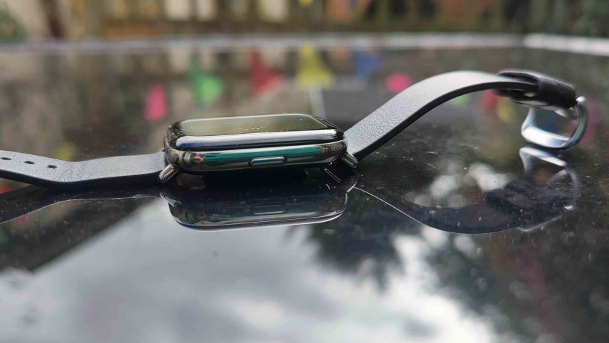
If you are going to offer up a lozenge-style then the comparisons to the Apple Watch are going to happen. And, yes, it does share a similar look but we couldn't help but be impressed with the design. It's extremely lightweight for a start - a watch you really don't mind having on when sleeping - with a watch face that oozes style.
The default analog clock is something of a charmer and is a good blend of the old and the new. If you do want something a bit more modern then there are myriad choices, even one that closely resembles Apple's Move rings.
The screen is 1.65in (42mm) AMOLED and has a nice curve around the edges. There's a bit of a bezel framing notifications and the like but this is mostly masked by the UI's dark design.
You have the option of an always-on display which is a nice touch but if you want to conserve the battery life (not that you need to, but more on that later) then the Zepp E is great at automatically turning on with a flick of the wrist.
The straps that come with the Zepp E range are okay. There are two in the box, they are leather but we would have preferred the option of a sports strap.
2. This is an app-lite experience
While most non-Apple based smartwatches usually have a hint of Android in them (even if they are using the likes of Tizen as an OS), the Zepp E has none of that, deciding to forge its own way when it comes to its operating system and it's best described as minimal.
There are no third-party apps on-board so you have to use Zepp's own apps to count your steps and the like. This is fine if you are not tied to any one app but may irk those whole like to use a particular app for fitness.
There are a lot of features here, though, so there isn't much FOMO. On board is a compass, fitness tracking, timers, alarms and a very good weather app. The music app allows you to flick through the songs you are listening to on your phone (it recognised Spotify for us, with no real issues) and you will also get your notifications through the Zepp E but there's no way to reply to them.
3. It's fitness first for the Zepp E
While third-party apps are a no no, the fitness features on the Zepp E are impressive. The aforementioned activity rings not only looks like Apple's Move rings but act like them, too - and it gets a little addictive to try and hit your steps and the like to close them off.
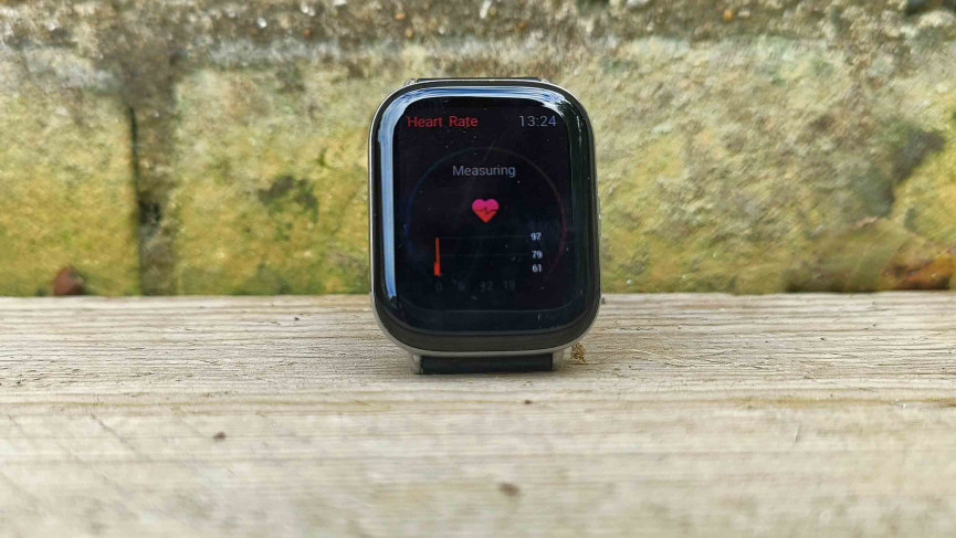
There's a heart-rate monitor that works well and is detailed in the data it gives you. Swipe up on the screen and you see your heart rate zone - from relaxed to maximum. There are options to track many a workout (including swimming, thanks to its 5ATM water resistance rating) and a PAI scorer. This is a personal activity intelligence score and is something that can also be found on the likes of Garmin products.
Sleep tracking is on board - not that you would know, until you go into the app - and it works well. It rates your sleep against others, which is fine but when you are over-worked and have a small child then the results are embarrassing. There is an abundance of data on board. We haven't really found a sleep tracker we like, though, and the Zepp E does get extra points for being one of the most comfortable smartwatches we've worn while in bed.
4. As a running watch it's missing a trick
The Zepp E is a streamlined smartwatch and, for the most part, this really works. We like the UI and how much of what you need is on a few screens as possible. This doesn't make for a cramped experience but some of the icons could do with being a touch bigger.
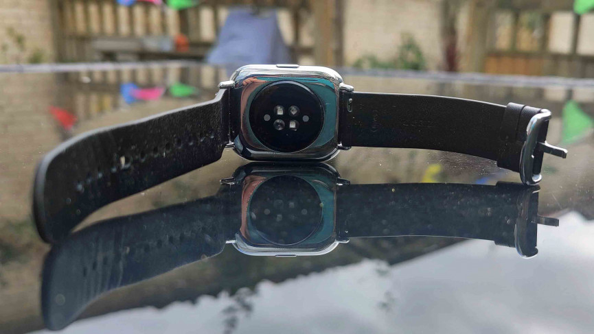
One big thing was missing, though, and that is GPS support. You miss this most when you want to go for a run. The lack of GPS means you'll need your phone to run with and even then tracking isn't as accurate as you would like it to be.
Things do get better after a run, though, as the post run data is impressive, with good information about the terrain you have just traversed and it all works with Strava, Google Fit etc.
5. The battery is a beauty
The lack of GPS does mean that the battery life on the Zepp E is superb. We got a good 5 days' use out of the smartwatch (7 is quoted) without having to put it on charge and when we did charge it, it's back up to full speed in around 90 minutes.
This would change if you opted for the always on display and rinsed the activity tracking but it's one of the better batteries we have seen in a smartwatch.
Final Verdict: Zepp E review
The Zepp E is a smart-looking, lightweight smartwatch that looks the part on the wrist and you hardly notice it's there.
Packed with a beautiful AMOLED screen, some in-depth data options for when you use it for fitness and a big battery life there is certainly a lot to like about the Zepp E. If you can forgive the lack of GPS and a bit-too streamlined UI then this watch does well for its circa £200 price.
- Apple Watch Series 6: 5 things to know about Apple's flagship smartwatch


